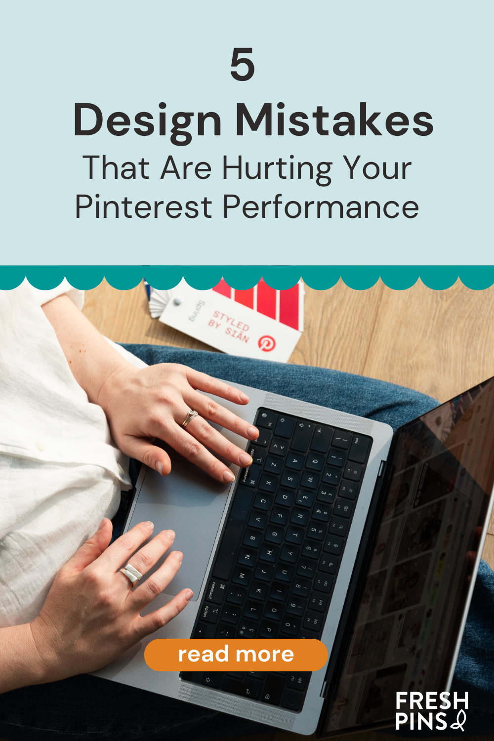
If you want your Pins to stand out on Pinterest, design is key. Today I’m sharing the most common design mistakes and how to fix them.
1. Always using the same color
If all your Pins have the same colors, they’ll end up looking identical.
- Don’t be afraid to mix things up—don’t limit yourself to just your brand colors.
- Choose your tones intentionally: every color evokes a different emotion (yellow = cheerful, red = warning).
- According to Tailwind, the most popular Pins use:
- Black and white
- Colors that match the photo
- Bold, vibrant colors
Tip: Color can be your best ally to highlight the message you want to share.
2. Always using the same text format
Text is a big part of your design, so pay attention to it.
- Vary the sizes to emphasize your keywords.
- Switch up your fonts to grab attention, but stick to two at most.
- Avoid italics in titles—save them for a specific word here and there, and only if they’re easy to read.
- Focus on what matters: your keywords, not connectors or filler words.
3. Using stock photos without editing them
Images are the foundation of a good Pin.
- Ideally, use your own photos—Pinterest values original content.
- If you’re using stock photos, edit them: crop, rotate, adjust—anything to make sure they don’t look identical to what’s already out there.
- Make sure they’re high quality and aligned with your brand’s style.
- And if you don’t have your own photos yet, try Pinterest’s collage tool.
4. Ignoring Pin dimensions
The size of your Pin has a big impact on how it looks in the feed.
- Pinterest recommends images at least 1000 px wide.
- The best-performing format is vertical, with a 2:3 ratio (1000 x 1500 px).
- If your content works better as a square, go for it—even if it goes against the vertical standard. Trust your own judgment when adjusting your designs.
- Avoid horizontal or “landscape” images: they usually get lost in the feed and don’t grab attention.
5. Forgetting your logo
Sometimes you’ll want to use colors beyond your brand palette, which makes adding your logo even more important.
- Keep it small so it doesn’t distract.
- If it doesn’t fit naturally, add your website link instead.
- The key is making sure people recognize your content and know how to find you again.
Why is it worth fixing these mistakes?
Good design goes beyond aesthetics.
- It increases your visibility.
- It encourages people to click on your content.
- It can drive more traffic to your site or even boost sales.
Small tweaks make a big difference. Start here, and your Pins won’t go unnoticed anymore.
Try these tips and watch how your Pinterest performance improves!

